Choosing the Right Hero Banner for Your Site

A common term in marketing which has been around since the first printing press is “Above the fold”. This phrase derives from the fact that newspapers are folded in half when displayed on newsstands, which means that only the top half of the page is displayed to the audience. In order to attract passers-by, editors will emphasise the content of this half with attention-grabbing headlines and imagery.
When we apply this logic to the web, we are talking about the content that is immediately on display when you visit a web page without any clicks or scrolling.
The “Hero Banner” - the area of the page between the main navigation and the start of the main page content - is the most important area of the home page. A good hero banner will grab the attention of the user and provide context for what they will find if they navigate throughout the rest of the site.
Below, we will showcase the variety of ways to make use of this space; how you can impact Search Engine Optimisation (SEO) and accessibility, and how this space can be utilised to drive engagement.
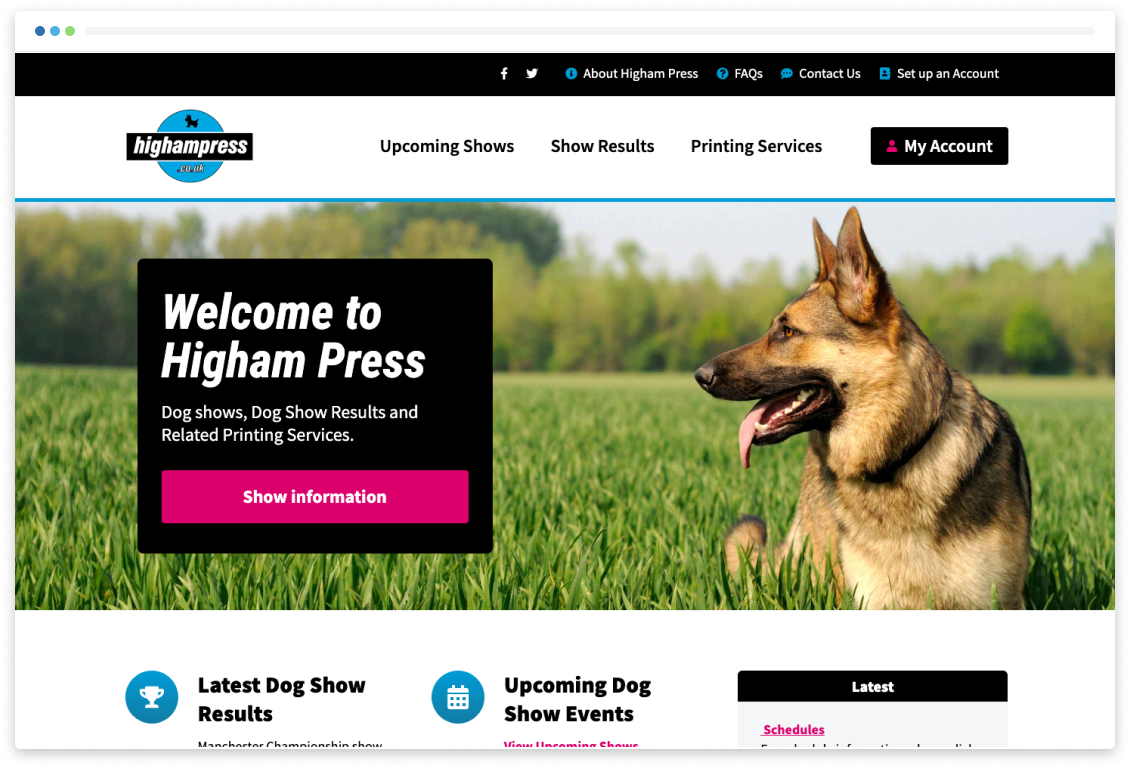
Image Banner - Tried and Tested
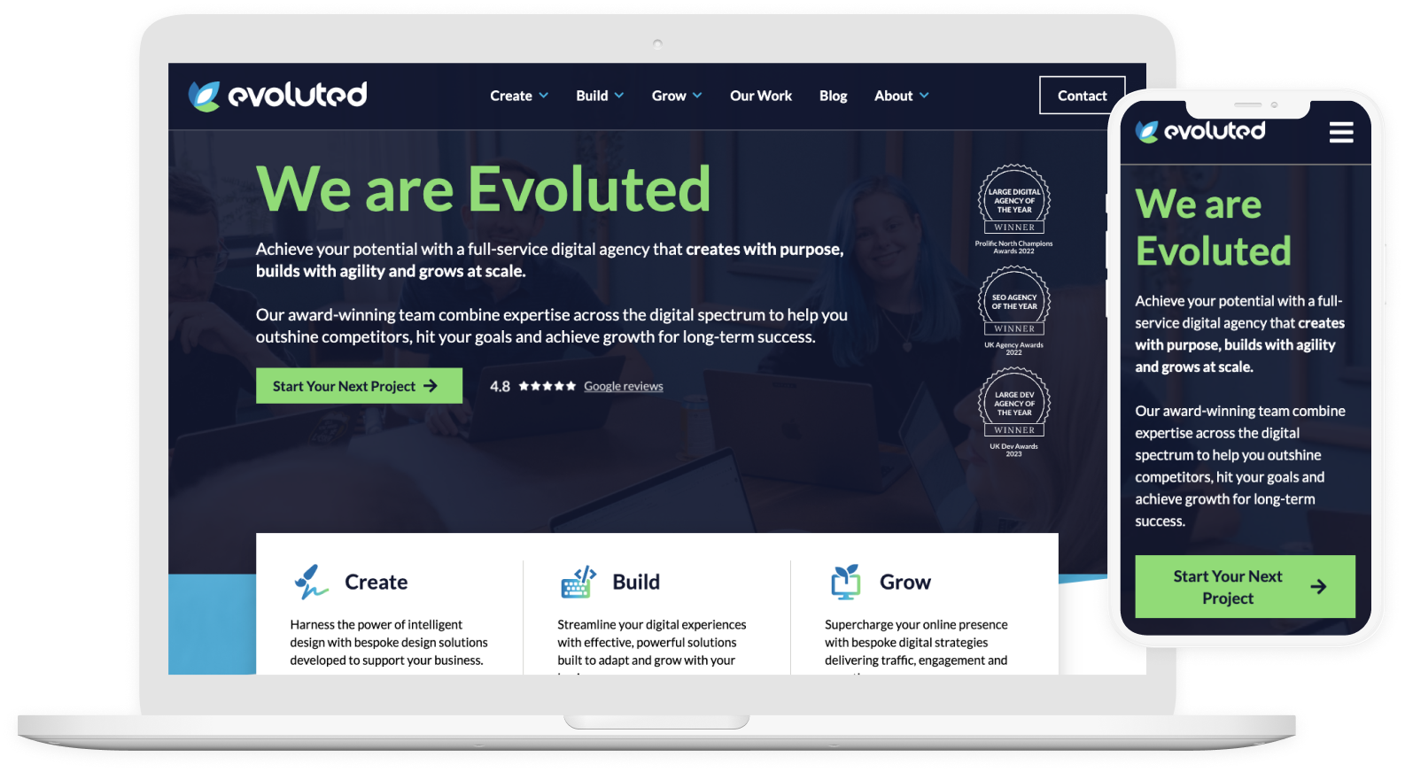
The right imagery on your website will make or break the time and effort that the development team has put in. Using a brand appropriate image with the correct resolution (typically 1920x1080 on desktop) and colour contrast will draw the eyes of the visitor.
Include a company strapline to give further context for what your website is about, this will often require a colour gradient to be placed behind the text to make sure that the font is legible. A button (‘call to action’) to drive traffic to a particular page.
Struggling to find the right imagery for your brand? Not sure where to direct users using a call to action? Ask your design agency, that’s what they are for.
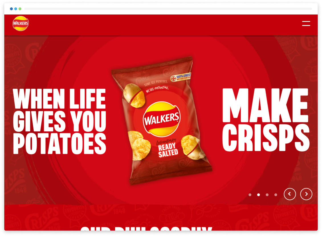
Image Carousel - Ineffective
The percentage of visitors to a website that engage with interactive carousels (or slideshow) remains extremely low. It is a well-established marketing principle that when you’re trying to get users to take action, one of the worst things you can do is present them with too many options.
Using Google Analytics Events we monitored the clicks inside of a Hero Banner carousel on an ecommerce website. The number of clicks for each slide can be seen below, the percentage is compared to the total number of page views during the two-week period this test was live (10,868 page views):
Slide 1: 529 (4.8%)
Slide 2: 26 (0.2%)
Slide 3: 6 (0.05%)
Slide 4: 26 (0.2%)
Of course there can be multiple reasons why these clicks are so low and optimising the slides with product offers and increasing the speed that the carousel automatically switches slides may improve the chances of a user clicking on one of the slides however with an average view time of 23 seconds this is unlikely.
On top of these issues, a poorly optimised carousel will increase loading times due to the extra assets that are required. If you want to allow customers to navigate between images/slides it is imperative to ensure these controls are accessible for all users.
When it comes to the use of banner carousels on your webpage, the costs often far outweigh any benefits.
Video Banner - If Done Properly
Adding a background video on the landing page of your website can leave a great impression on new visitors and give a taste of your business. While it can come with a heavy cost, both in time and resources, video marketing is now the most effective way to drive engagement and so this media could be put to extra use.
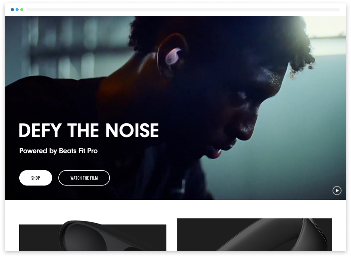
One great example of a video background that has been put together with great effort and presented as a decorative element on the page is the Beats by Dre website.
The video is 15 seconds long.
Has been carefully edited to allow for a perfect loop.
No audio or text included.
File size is 5MB.
Option to pause the video.
Dark overlay to allow greater contrast with white text.
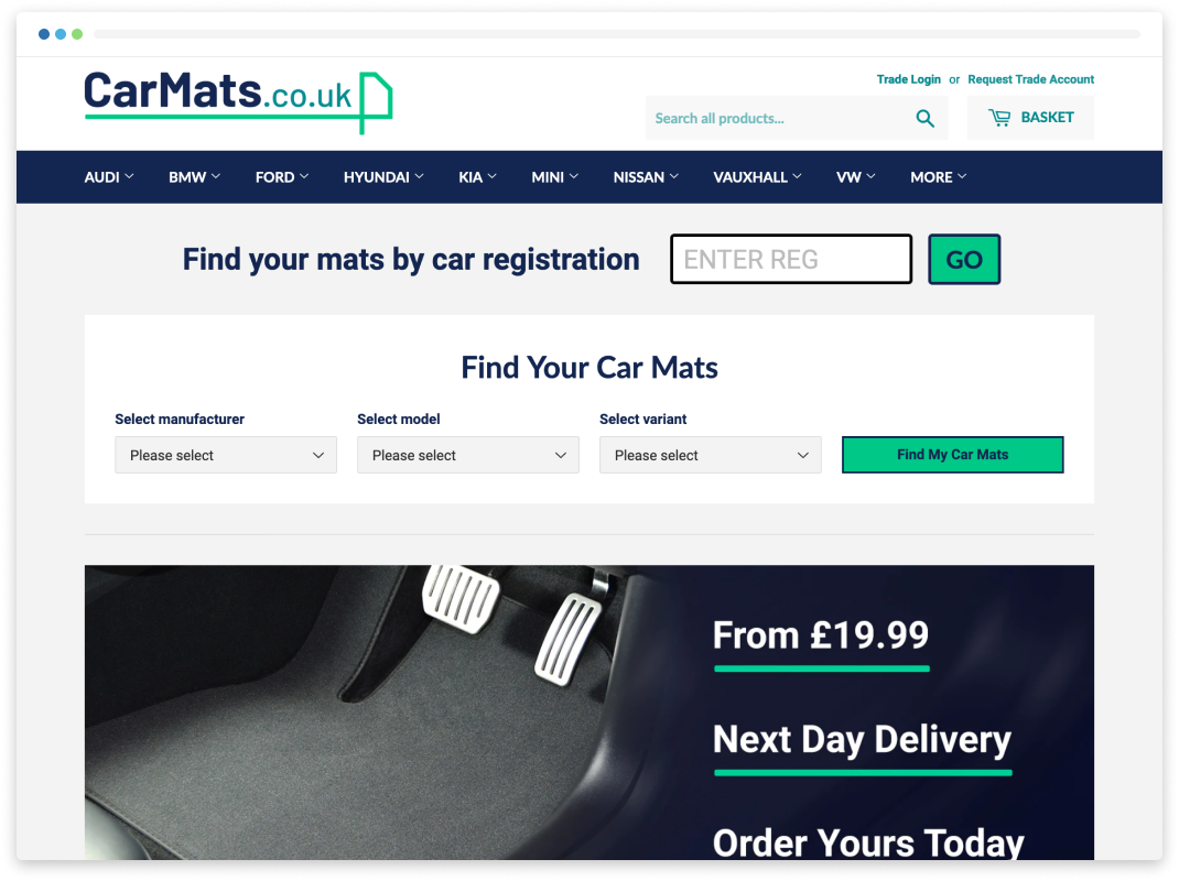
No Banner - Straight to the Point
Optionally, the best experience for your customers might be to avoid this extra page content and to deliver them exactly what they need. CarMats.co.uk includes a small search form right at the top of the page making it clear and obvious what the next steps are for visitors.
This simple, efficient user journey works well as customers arrive on the site with a clear purpose and a product in mind, rather than needing to be sold on the benefits of the product - which would require more of an 'experience'.
Always keep the user in mind - what are they coming to your website for and what is the most efficient way to deliver that to them particularly when selling a product or service.
For expert help developing your website to unlock business growth from our 2023 Large Dev Agency of the Year-winning team, see our Build services.

Liam joined our Web Development team in 2022, bringing a wealth of experience in various coding languages. He began an apprenticeship working in programming straight from school before realising his true passion was in Javascript and CSS.
Although based in Glasgow, Liam joins our team in Sheffield when he can.