Why Colour Matters In the Digital World

Colour matters.
Online the use of colour brings a site to life, it draws attention to a call to action, it adds drama, personality and shows products at their best. The way colour is used matters, but this isn’t a post about colour theory. I’m not going to write about the way colours make us feel, or colour palette combos. We don’t all see colours in the same way, and that’s what this post is about.
STRAINING TO SEE IT
When the printer runs out of ink and the words become as easy to see as a snowfox in a blizzard, you sigh and start to order some more ink. You can’t use the version with text you can’t read. The online equivalent of this is using text with poor contrast to the background. Pale grey on a white background is not dissimilar to a lack of toner, people are going to struggle to read it.
READABILITY IS IMPORTANT
Getting people to read copy on your site is already a tough job. Studies show that people scan a page looking for key info only, and don’t spend much time reading.
The Nielson Norman Group updated their findings on 13 years of research in April 2020 about how people read online.
HotJar has a helpful introduction to Website Readability and why it matters.
UX Myths has some great links to various other studies on the subject too like: Do people read on the web?
To help with this you’ve spent time with a copywriter, drafting concise, engaging content that is easy to digest. If the colours on the site don’t have enough contrast it’s going to be really hard to read, and this means it is more likely to be skipped.
SKIPPING CONTENT
When content is skipped, people miss important info. When they miss info they can get frustrated - either straight away, or in the future. Frustration with a site (and therefore a business) is the mortal enemy of conversions.
When your customer misses out on information, there’s a good chance you will miss out on sales.
CONTRAST TRAPS
Contrast can be tricky.
It’s not just a case of a pale colour against a pale background, some colours just don’t work well together (from a contrast point of view).At first glance there may not be an issue - so it’s worth looking a little deeper.
Not everyone sees colour the same way. In the UK there are approx 3 million people (most of them men) with colour vision deficiency. A lot of people don’t know they have this until they are adults, and often find out unexpectedly especially when it’s linked to a health condition such as diabetes.
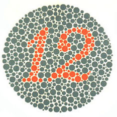
Colour vision deficiency is sometimes called colour blindness. Worldwide it affects 8% of the male population (1 in 12), and 0.5% of women (1 in 200). There are different kinds of Colour vision deficiency, but they all make it hard to tell some colours apart, and some colours appear dull rather than vibrant. The Ishihara Test is one of the most well known for Colour vision deficiency because it has been around since 1917!
The Ishihara Plates are circles of dots with numbers “hidden” within them.The combination of colour and pattern means that some people cannot see the hidden number.
It’s not just those with Colour vision deficiency who struggle to see the difference between colours. Correct colour contrast is also important for people with dyslexia as this supports making text easier to read. When you’re out and about on your phone that pesky daylight can make it harder to view the screen. If the contrast is poor it will be harder to see. In fact, all users will benefit from colour contrast. When it’s right it’s easier to read text. That’s a win for everyone.
GETTING CONTRAST RIGHT
So how do you get contrast right? Fortunately there are some really helpful tools to help us pick our text and background colours.
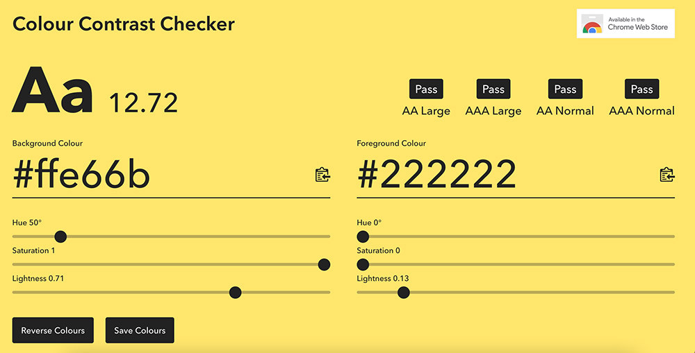
One of my favourites for a quick check online is Colour contrast checker but there are plenty of other tools out there. This online tool checks if the contrast passes the WCAG 2.0 standards for web accessibility. This uses a seemingly complex scoring system for the contrast between two colours. For AA and AAA standard at large and normal sized text there are different scores required for a pass. Helpfully this is displayed in the top right, so you know if your choice is perfect for large headings, but not for body copy!
It’s important to note that these standards require suitable font sizes.Normal is 14pt, large is 18pt.
Let’s take a look at the Nielson Norman Group site which has a very simple colour palette. This site is based around people sitting and reading a lengthy article, so getting people to focus and read the text is incredibly important to them, and they want it to be a visually comfortable experience. The reduced range of colours means it’s extra obvious when the colour changes that it means something.
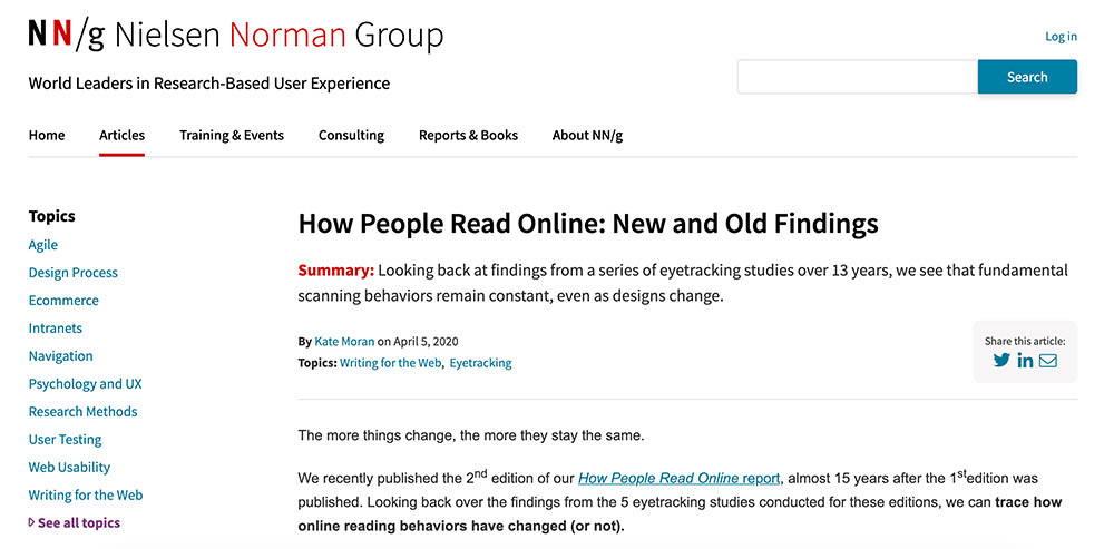
But that blue-grey colour is it really providing enough contrast to ensure the links are obvious to everyone?
Let’s find out by using the Colour Contrast Checker and two of my favourite browser extensions: WhatFont and ColorPick Eyedropper.
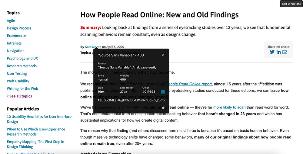
Using WhatFont I select the link on the author to see information about the text, including the font, the size and the colour!
I can now set the Foreground colour in Colour contrast checker to: #017698
The background of the site looks white to me, but to be sure I’m going to use the ColorPick Eyedropper.
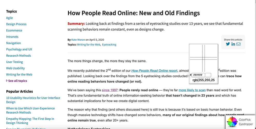
This confirms that the background is white, so I can set the Background colour in Colour contrast checker to :#ffffff
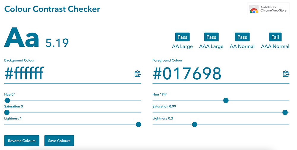
This shows that this colour combo has great contrast for:
AA standard for both large and normal size text.
AAA standard for large size only.
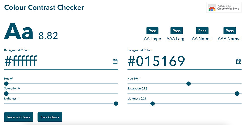
To achieve AAA for normal size text it’s possible to adjust the Foreground and Background colours with the sliders. One option is to drop the Lightness setting to achieve a darker blue. This now passes everything. It provides great contrast with the background colour - but it’s too similar to the body copy colour to really stand out on the website as a link.
I had a play with the Hue and the Lightness to create a brighter blue. This also passes everything, and would stand out on the site clearly as link text.
However it may draw a little too much attention to itself, making the choice of the blue-grey a very solid design decision.
IMAGES
It’s not just text on a plain background that needs to be checked for contrast.
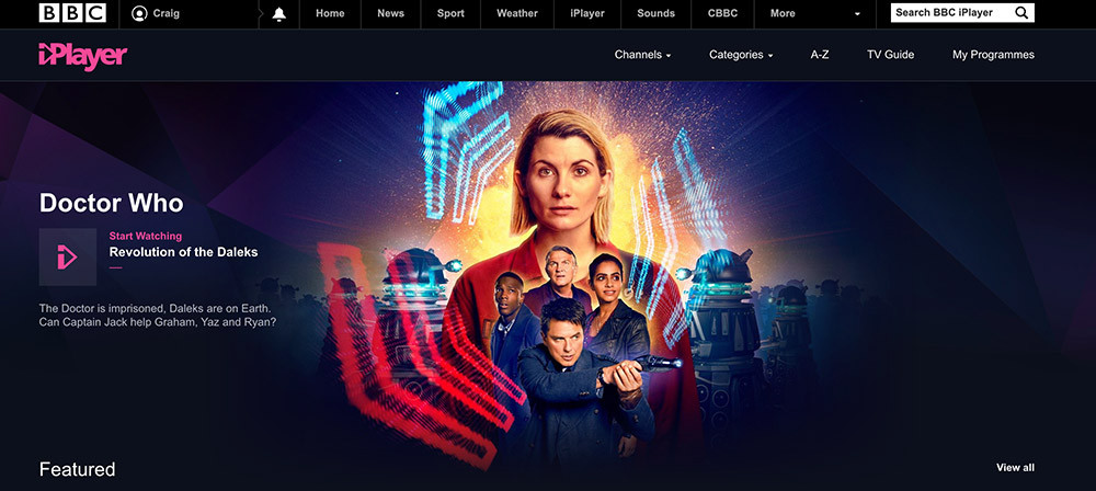
Quite often a site will have a hero image on a page with HTML text positioned on top it. This means you need to carefully choose your image to ensure the text is still readable. BBC IPlayer helps themselves out by adding a dark gradient behind the text, but on top of the image - making it the filling in the sandwich.
SUMMARY
Colour matters. Next time you discuss colours with your designer, ask if they have considered the colour contrast and check which levels it’s passing. Keep contrast in mind when you’re browsing the web and see if you can spot places where it’s not so great. You can always use the Colour Contrast Checker yourself to see if the content is passing checks.
Want to learn more about web design best practice? Check out our free Ultimate Guide to Website UX, packed with tips on design processes, testing UX changes and improving website accessibility!
If you require expert support with your next web development project, check out our development and UX services today.